Home Staging is not difficult to understand but it can be hard for a homeowner to implement. The premise is that when you sell your home, you are selling a product. Retail businesses know that a well-designed storefront draws more people into their business and more money is spent as a result. It is the same for your home, and as in retail, it starts before the potential purchaser is inside.
Porch Perfect
Creating a beautiful vignette at the entrance to your home will automatically intrigue – and relax – the public. They will start the process of viewing “their” potential home in good spirits.
This does not mean a home seller must spend a lot of money. A clean entrance with a welcoming vignette is all that is needed. Money spent can be on items that go with the homeowner after the sale. If you are unsure how to go about “staging” your home, most designers offer various consultation packages to help you.
 Get The Look
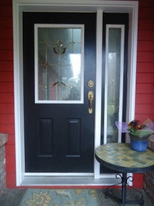
A dramatic black door against the rich red of this home’s hardiplank siding is set off beautifully by white trim. The large doormat that is usually in front of the door is where the homeowners two dogs hang out, and is therefore more functional then decorative. It is whisked away before guests arrive and a smaller, “prettier” one replaces it. The smaller size is more in keeping with the scale of the porch.
Porch space is limited but becomes functional with the addition of a small table. This gives the homeowner and guests alike a place to set down a purse, phone or bag. A small seasonal flowering plant in a narrow blue-glazed pot adds additional colour without interfering with the usefulness of the table.
Pretty, functional and clean; it sets the stage for everyone who arrives. It is porch perfect.
Fabulous Foyers
Entryways are forgotten places … shoes piled up by the door, a mess of coats in a closet or on a coat rack. For your everyday life this might work, but when staging your home for resale, do not underestimate the importance of a clean and functional foyer. Don’t forget that your home is now a product and the public will have a critical eye. If you have already created a beautiful vignette at the exterior entrance to your home, don’t disappoint your potential homebuyer as soon as they step inside.
A clean, uncluttered entrance that gives your visitor a place to put their shoes, coat, umbrella, parcels, etc. while they tour your home will keep them at ease. That “I could live here” feeling is your goal. Add to the vignette a mirror for guests to check themselves when they are ready to leave and they will exit your home feeling happy and looked after.
 Get The Look
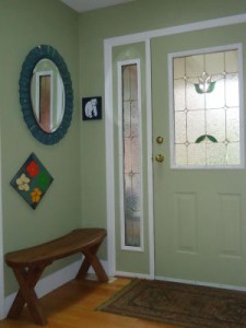
By painting the interior of this entry door the same colour as the walls (a soft celery hue), attention stays with the compact vignette in the small space to the left of the door. This entry is kept simple in order to leave the space feeling as open as possible. Although it is small and sparsely furnished, it has all the essentials: a basic cedar bench to sit on or toss a jacket or parcel, a boot mat below the bench to hold wet shoes, an artistic mirror that is both beautiful and functional, a couple of bright and colourful paintings, and a multi-toned large doormat. That’s it. That’s all it took to create a warm, friendly and fabulous foyer.
In this scenario, there is nowhere to hang a coat because there is a coat closet on the opposite wall. If your home does not have a closet, a few interesting coat pegs kept empty on the wall opposite the vignette will give visitors a place to hang a coat, scarf, hat or umbrella. A small floating shelf could also be located above the coat pegs.
Lux Living Rooms
Living spaces are the hub of activity in a house and can therefore be a mishmash of clutter and stuff. Things make it into the space and never leave. If you are selling your home, editing the area is a must. Toss what isn’t needed and pack up your mementos until you have a space that is simple, inviting and functional. With your home now on display as a product, think of the room as an ad in a magazine. In fact, look in magazines to see how they display furniture in advertisements. These ads are meant to have an impact on as many people as possible. This is exactly what you are now trying to achieve.
A clean, simple space will allow visitors to imagine their own furnishings in the room rather then focusing on yours. It will easily let them know how a conversation area will work and where the TV goes. With too many knick-knacks in the space, they will be distracted by everything around them rather then imagining themselves living there. If they can successfully imagine the look of the room with their own furnishings, you are on your way to having a potential buyer.
 Get The Look
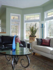
This living room is warm and inviting with its strategic use of colour. The walls in the space continue the soft celery hue from the foyer; the couches are both leather, one is jet-black and the other a light tan. Punches of cobalt-blue-hue, green-gold and crimson are casually introduced by the use of vases and pillows. A living Snake Plant set into a one of a kind piece of pottery creates a sculptural statement on the side table between the leather couches. A multi-toned area rug defines the sitting area without overpowering it.
The room feels comfortably spacious and uncluttered. Even though the couches are leather and the floors are hardwood, there is enough “softscaping” with the use of the area rug and pillows to keep the space cozy and warm. The unique coffee table, one a kind pottery and sparkling vases keep the room visually interesting. It is a lux looking living room.
 Evelyn M, Associate of Interior Design
250-204-4417
www.EvelynM.com
Evelyn M Interiors/Design House BC
Evelyn M Fine Art
See all articles by Evelyn M


One with the refuted arguments about storage boxes and corrugated totes is they
don’t support the beneficial to our environment movement that has
happened using this generation. Climate can be another reason why self storage facilities are
really much in use. Administrators can hot swap disks or move data with other devices without affecting
data access.
I’m really enjoying the design and layout of your website. It’s a really easy on the eyes which makes it a lot more pleasant for me to come correct here and visit more often. Did you hire out a designer to create your theme? Superb work!
Thank your for your kind words. Island Woman was designed by us to be easy to use and easy to read.
I love your dog! Interesting article ,it shows first impressions matter and we can create that with small and interesting changes.
Hi Trish, yes small things do make a big difference but are often forgotten in the “greater scheme of things”. Sellers start to focus in on the big ticket items and forget to do the little adjustments. Glad you liked my blog, I love getting feedback.