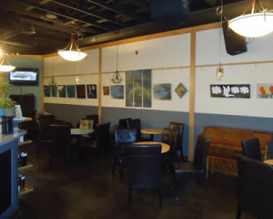
 We were excited to take on the interior design of Campbell River’s Serious Coffee earlier this year. Before we began, the coffee shop was orange everywhere – display counter, all the walls and even the bathroom ceiling. But orange is just a colour and can easily be replaced with a more current scheme in both the paint and the materials chosen.
The brief from the chain’s headquarters was to create an industrial West Coast vibe with an emphasis on creating a space that would showcase the rotating artwork on the shop’s gallery walls. I think this end result fits the brief perfectly.
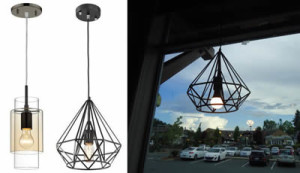 The new lighting I sourced for Serious Coffee has an edgy, industrial, artsy and very modern vibe with its transparency and geostyle shapes. I also made sure each bulb was LED for energy and cost savings throughout the year. Luckily, LED bulbs come in all shapes and sizes and can easily replace the bulbs in most fixtures.
Since showcasing art is an important aspect of the coffee shop’s vibe and up until now artists simply added to the many holes in the walls every time a show changed, I needed to come up with a solution that would negate the need to damage the walls. 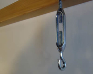 This custom gallery rail system that I designed and Bruce built in our Design House shop includes an aluminum turnbuckle that allows the artists to adjust the height of their photos or paintings by up to 1” which makes the hanging experience far less frustrating. This is a feature missing from most gallery systems and that lack of adjust-ability has always frustrated me when I have hung my own work on stock systems. The rail itself is Douglas-fir as is the rest of the new woodworking.
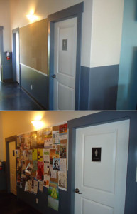 There is a short hall in the space that leads to the men’s and women’s washroom. Originally there was a small bulletin board that was covered with posters expanding out and around to fill the wall as well. Again, holes everywhere on the wall! I designed a large cork board to take up the complete space between the two washrooms and it only took a couple of days for people to fill it up with their event posters. Wow! The cork is mounted on plywood, so no more holes all over the wall.
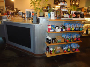 Another custom feature that we created for Serious Coffee was a new retail shelving system that can hold up to 16 feet of product. We had to remove one of two cream and sugar counters to install this, but the retail space was much needed as up until then, there was none. The nickel adjustable shelving unit is mounted onto a sheet of plywood painted with a hammered silver finish and the Douglas-fir shelving has small lips on it to stop product from accidentally falling to the floor.
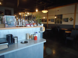 Between the retail shelving and the service counter is a new painted blackboard framed in the same grey as the lower third of the main walls. The rest of the service counter is painted in metallic silver with a faux aluminum finish.
With the renovation complete, the space has taken on a whole new feel … one that is relaxing, intimate and definitely artsy. It is a definitely a”go to spot” so when you’re in Campbell River next, you will definitely have to go and enjoy both the coffee (or tea) and the art.
 Evelyn M, Associate of Interior Design
250-204-4417
www.EvelynM.com
Evelyn M Interiors/Design House BC
Evelyn M Fine Art
See all articles by Evelyn M

