Bill’s Complete Master Redo
Redesigning Bill’s master bedroom was so much fun. He gave me a budget and the keys and said good bye as he left on a one month vacation. The only thing he said was “Wow me when I get home”. Then, from the airport he phoned and said “what was I thinking … I want new carpeting too so the budget needs to be bigger. How much more will you need?”. The trust, you see, was already built in as this was the last room in his house for us to renovate, decorate and stage.
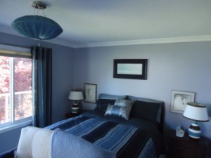 With the budget we had, the only thing we kept was the furniture and the two bedside lamps as they were fairly new. Because the bases on the lamps sported a contemporary geometric blue, white and espresso horizontal stripe, I wanted to use them as a feature of the completed bedroom. The bedroom received new windows, baseboard heaters and crown moulding. The walls were painted a dusky shade of soft grey to tone in with the panoramic view through the glazings, and I sourced out an awesome quilt cover with blue, charcoal and ash grey stripes through Gourmet Essentials. From there, I went looking for pillows and drapery to complete the bed vignette. Once I had everything softscaped, I sat down at the Lite Shop and went through all their catalogues looking for the perfect pendant, and did I ever find it!
When Bill came home, he was both excited and amazed that I could pull together a design that he was absolutely in love with. The only thing that was changed was a new budget for a custom entertainment centre to hold his bedroom TV and stereo equipment, and of course we happily took on this extra feature.
Lyn’s Wood Celebration
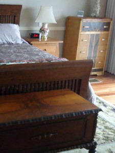 Lyn loves antiques but she also loves well-crafted wood pieces with a more contemporary aesthetic. So when we were choosing new furniture for her master suite, I decided to start with a modern bed that featured exquisite wood craftsmanship, building on the room’s selection from there.
The bed we chose is an Amish piece, and after settling on the design, wood and wood finish, we continued with Amish furniture for her nightstands – but in a different design, wood and finish – it was important not to match the pieces so we could then layer in individual antiques and contemporary pieces for an overall cohesive look. The tall boy dresser with the waterfall front came from Les’s Old and New in Campbell River, while the storage bench at the foot of the bed was sourced at Quality Antiques in Courtenay as was a low boy dresser with marble top (not seen in the photo). We also layered in a contemporary chrome and glass table with two upholstered side chairs in burnt orange for a complete, well rounded aesthetic. Before purchasing the chairs, I suggested that Lyn take a book and read it for a half hour on a chair of the same design on the store’s floor to make sure it was a good “comfort” fit.
Dawn’s Storage Dilemma
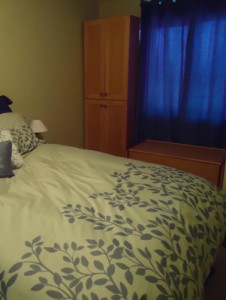 In Dawn’s master bedroom, there was not enough closet space for her clothes. The closet was simply too small and there wasn’t enough room to make it larger. There was, however, a niche along the window wall, deep and wide enough for extra storage. We custom built a non-built-in tall wardrobe and a storage bench so that in the future, when and if she moves, she can take them with her. With the storage bench below the window, it’s the perfect place to read a book or enjoy the garden beyond. We custom made both the wardrobe and storage bench out of Douglas-fir, but added in Purple Heart detail on the outside of the bench and Aromatic Cedar on the inside. We also painted the bedroom a soft celery green to go with Dawn’s favourite green and grey bedding. Dark blue drapes and bed sheets were added to the mix for a punch of colour.
 Redonda’s Guest Bedroom
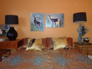
Redonda had already painted her guest bedroom a shade of orange with coppery undertones. She loved the colour but did not know how to build the room into a cohesive look. She already had an orange-stained desk and chair, and I suggested we use it instead of one of the night stands so her guests would have a work station for laptops, iPads, books or paperwork. Redonda was worried that the difference in height between the desk and nightstand would make lamp placement awkward, but we found two thrift store lamps – one short and squat and one tall and lean – that became the same height when placed on the two different pieces of furniture. The lamps had ugly shades but it was simply a matter of switching them out with two matching black ones to create a uniform look. From there, I started sourcing out a quilt cover and this was not an easy task. Finally, I found a copper coloured cover with blue detail that was the perfect choice for the room. I also picked out two painting in the same size but different orientation to play up the asymmetry of layout and luckily, one of the two paintings also featured a copper colour within it.
 Daniel’s Diagonal Divide
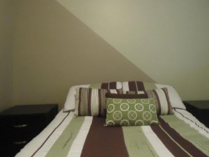
Daniel’s daughter’s bedroom was very small. She had a new quilt cover in green, white and brown stripes which helped give extra length to the room but the width was still teeny tiny, both visually and in reality. There was not much I could do about the reality of the width, but I could visually widen the room by creating a diagonal division from top left corner all the way down to the bottom right on both the head board wall and the foot wall. I then chose a tan hue that corresponded with the brown in the bedding for one half of the room and a green hue for the other half. The length of the diagonal division brings extra, needed width to the room visually and the soft “greyed” colours allow the walls to recede into the background.
 Irene’s Criss-Crossed Wall
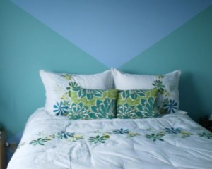
Irene already had her bedding and furniture but was at a loss as to what colour she should paint the room. Since her room had a symmetrical layout with no headboard on the wall behind the bed, I suggested using two colours of paint to create a headboard criss-cross graphic via colour blocking. I chose colours that not only worked with her bedding but also the rest of the room, using a blue shade for the complete room and a green tone for the two horizontal triangles within the criss-crossed wall detail.
The Rest
Most of these bedrooms were among several renovations that we did throughout our clients’ homes and if you would like to see the rest of each home, simply go to our Design House portfolio page by clicking here. Enjoy!
 Evelyn M, Associate of Interior Design
250-204-4417
www.EvelynM.com
Evelyn M Interiors/Design House BC
Evelyn M Fine Art
See all articles by Evelyn M


