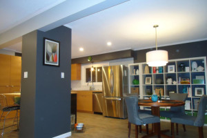
 When my Comox customers first approached me to come up with a whole home concept to convert their single family 2-storey home into a residence with a self-contained rental suite downstairs, I got very excited. Now that the renovations are complete, I am just as excited.
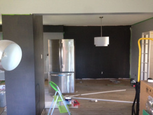 Originally the homeowner wanted a white-on-white kitchen with white walls and pale flooring. She was a fan of mid-century and Scandinavian design and had a collection of vintage pieces scattered throughout her home.
I didn’t want her “new” home to be caught in the trap of one look – and a period one at that – so after much discussion, she agreed to refocus the final design on contrasting elements in order to blend the vintage with the modern.
 Even so, when the almost black paint went up, she started to panic. On its own, it is very demanding and dark but with a wall of bright white cubes in front of it and warm wood beside it, the effect is neither dark nor overpowering, but rather bold and exciting.
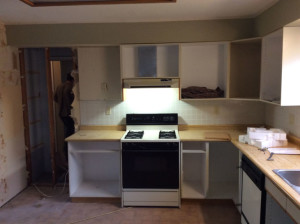
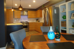 It’s hard to believe that the social zone started out with a self-contained 50s kitchen that was not very functional and very claustrophobic. Now, the kitchen flows seamlessly to the dining area and although it still only has just one small window, the space is light, bright and cheerful.
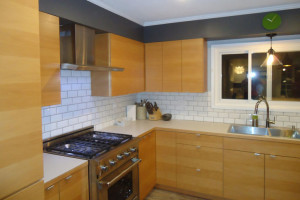 The lightness is arrived at by using white counters and back-splash that play beautifully off the white shelving in the dining room. The dark drama continues in the kitchen via a black stained island, black pendant lighting over the island, a dark grey column attached to the island and dark grey soffits over the cabinets.
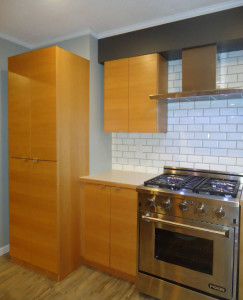 This contrast of cool greys and stainless steels against the soft warmth of wood creates a balance that complements the dark and pale greys/whites used in the rest of the home. Even though the effect is dramatic, it is still neutral, allowing the home owner to layer in pops of bright colour such as the emerald green clock over the kitchen window.
Another way we created eye candy for this home was by designing and building custom cabinetry in a flat panel using edge grain, book-matched Douglas fir. By book-matching the wood, the grain travels from one door to the next in one uninterrupted pattern.
To keep the focus on the grain, slim – almost disappearing – handles were used on each door/drawer. The look of the woodworking is very clean, minimalist and definitely modern, and we contrasted it with a weathered more rustic looking floor of vinyl planks. Vinyl was chosen over wood because the homeowners own a dog and unfortunately dogs and hardwood are a recipe for scratched up floors.
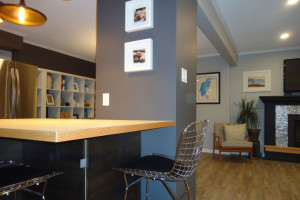 One of the structural elements we had to work around was the downstairs furnace flue that came up right where the kitchen and dining areas met. Rather than minimizing the column, I chose instead to highlight it with the same almost-black shade of grey used on the dining room wall, which doesn’t seem quite as dark next to the black stain on the island’s fir surround. Continuing the theme of black, white and all shades in-between, the homeowners repainted their fireplace surround in black, and re-tiled it in stainless steel penny tiles.
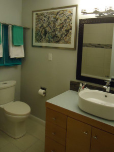 For the bathroom, we kept the original 1950s vanity and simply refaced it in the same Douglas fir edge grain, book-matched detail used in the kitchen, but switched up the look with a different, much darker back-splash. Depth of colour was brought in on the mirror frame and the Jackson Pollock print on the wall. Once more, the room is a study of contrasting neutrals, allowing the homeowners to have some fun with colour for their towel and accessory choices.
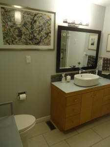 Instead of adding a touch of rustic on the floor, we created a more Zen atmosphere with soft shades of striated browns and beiges in 12”x 24” floor tiles and tub/shower surround, with more striated but darker glass tiles on the back-splash and shower/tub details. The bathroom is small but we were still able to design it with a stand-alone shower right next to the tub, opposite the vanity and toilet zones.
This bathroom is quite different from the Whimsical White Washroom and Peggy’s bathroom update, as is the kitchen very different to Tina’s Tiny Kitchen Transformation and Kris’ Kitchen Reno, all previously written about for Island Woman.
But that’s the challenge of being an Interior Designer. Each customer has their own wants, needs and tastes and it is my job to create a home for them that is uniquely theirs and beyond their wildest expectations. I love what I do and I love working with my customers to create results that not only work for them functionally but also reflect their personalities both aesthetically and intellectually. On a final note, my Comox customers had a large collection of art, both originals and prints as well as a large selection of fun accessories, so I had a blast when it came time to “dress” their home. There is an “art to hanging art” and arranging accessories, and I just love the process.
 Evelyn M, Associate of Interior Design
250-204-4417
www.EvelynM.com
Evelyn M Interiors/Design House BC
Evelyn M Fine Art
See all articles by Evelyn M


