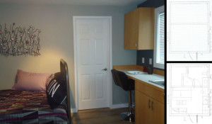
 Earlier this year, I was approached to design a self-contained suite within a detached building on my customer’s property. The building is 16’-6”x13”-6” and was already separated into two sections, each with their own entrance. The idea was to turn the larger of the two spaces into the social/sleeping and kitchen zones and steal enough space from the second zone to build a bathroom, still allowing the homeowners to retain a small storage space for their outdoor furnishings come winter.
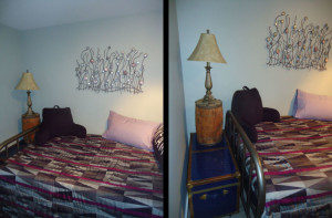 The homeowners had one jumping off point and that was an abstract metal sculpture that resembled kelp, and we based the colours within the small space on this art piece. Originally my plan called for a futon that could be opened and closed as need be but the homeowners chose to use a twin-sized bed they had in storage. Once we accessorized it into a day bed, it became a comfortable and beautiful sitting place when watching TV or entertaining guests. The homeowners also had a blue chest that was positioned to act as a side table while providing valuable extra storage within. On top of the chest is a barrel that holds a lamp and the barrel also offers extra storage. Both the bed and the chest are on wheels for easy accessibility.
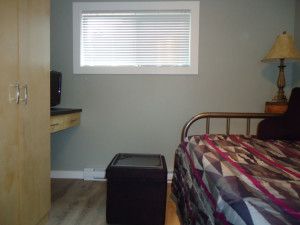 Across from the bed is a small wardrobe and media station with a storage ottoman beneath that is also on wheels and can be pulled over to act as a coffee table, or as extra seating when visitors drop by.
Originally the idea was to create a colour story to play off the amazing ocean view that the suite looks out on, but a second geostyle story started to unfold with the purchase of the bedding. The bedding featured a triangular motif of purples and greys layered in a fun and youthful design that I wanted to play off.
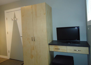 So I added a bold wall graphic to the entry door, using an eggshell finish wall colour and keeping a semi-gloss white paint in the area of the door handle for easy cleaning. The graphic breaks up the size of the door and creates a nice balance to the media station on the other side of the wardrobe. A second way to break up the large size of the door was to install a white triple hook unit that slices through the large triangle .
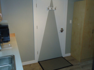 The entry door is positioned between the kitchen counter and the social area, creating a nice visual divide between the two spaces. We played up this divide by choosing pine for the wardrobe and media counter, and Douglas-fir for the kitchen cabinetry – all built in our Design House shop. By placing the wardrobe next to the door, it offers the perfect place to tuck away shoes and jackets, as well as a broom and a small vacuum.
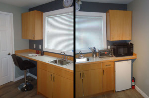 The kitchen is an asymmetrical design with a bar counter on one end for eating, studying or cruising the web; the other side holds an under-counter fridge and above-counter microwave and sink. There is also a toaster oven, kettle and plug-in cook top. One drawer is split into two levels, with a utensil holder fitted onto the top of the drawer edges, leaving room for larger items below. To highlight the view, the window wall was painted a dark charcoal so that even on a cloudy day, the panoramic ocean view will “pop”.
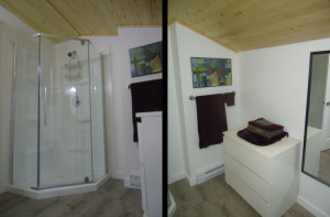
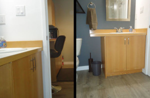 The doorway next to the counter – on the opposite side of the room from the entry door – leads to the bathroom. Here, even though there is no window, the dark charcoal colour was carried through for a visual continuum. This repeating element was also used in both the cabinetry and floor treatment; however, the soft greyish-green on the social zone’s other three walls was replaced with a bright white. This allowed the toilet, storage dresser and shower to blend into the background which gives the room a “feeling” of being larger than it actually is.
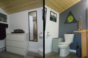 Purple was brought into this room via the towels, and pine was also introduced by using it on the ceiling. Using pine on the ceiling also keeps the room from feeling too stark. By featuring three distinctly different artworks on the wall which bring in strong, vibrant greens as well as geostyle elements, the room is filled with a vibrancy usually missing in a space that features white.
 It is amazing how comfortable and efficient this unit is – so much so that the first person to come and look at it rented it on the spot. The homeowners were so excited about the project that even before it was complete, they booked us to transform their kitchen in the main building into another Design House special. This won’t happen until the spring but I can’t wait to get started on it!
 Evelyn M, Associate of Interior Design
250-204-4417
www.EvelynM.com
Evelyn M Interiors/Design House BC
Evelyn M Fine Art
See all articles by Evelyn M

