It never fails to amaze me how many people say they wish they could hang more of their art in their homes, but they can’t because their walls are full. Then I take a look and realize that the walls aren’t full of art at all. After rearranging their collections to create compositions that include more then one piece per wall area, the results are usually far more interesting and include more pieces than before.
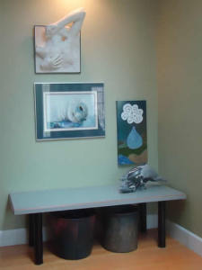 Homeowners usually hang art or photos in a line, with way too much space between each piece. For example, in the foyer shown at right, most people would have hung one piece over the bench/table and the result would have been “ho-hum”. Instead, I hung three pieces in a vignette that plays off the marble dolphins positioned, not in the centre of the bench/table, but off to the side. Underneath the bench/table is a pair of large raku pots that double as hat/glove and dog leash containers. The result is a functional artistic statement that flows seamlessly with the vignette above it.
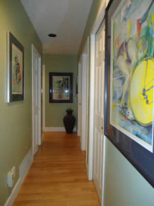 Hallways are another great place to showcase multiple paintings and/or photographs, and don’t be afraid to choose large pieces that fill the wall with vibrancy and life. All too often, halls are ignored and become no more then a place to go from point A to point B. How much more enjoyable is it to treat the space like a gallery? With no furniture below or beside the paintings, the rule of thumb is to hang each piece with two-thirds of it below 5’6” and one-third above.
Like halls, stairwells are locations where homeowners either avoid hanging art completely or feature one single piece. My favourite way of hanging art over a stairwell is to play off of the ever dropping – or rising – tread line.
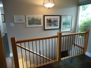 Often this means that when I am hired to hang art throughout a home, I start with the stairs so that I have as large a selection of art as possible to create the staggered vignette. The tricky part is to decide what line to use for the height. In this case the foyer was off the stairs so the two-third/one-third, choice was made for me.
Stairwells aren’t the only place homeowners hang only one piece per wall. Living rooms are often treated similarly but I think it is far more interesting to group paintings no matter how small or large. Frames, sizes, mats, colours and styles do not have to match; you just have to love them.
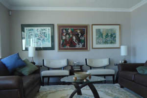 The three paintings in the living room shown to the left are all completely different, but that’s what gives the room its personality. By creating a vignette with multiple colours and styles, it becomes so much easier to layer in any colour and style of accessory.
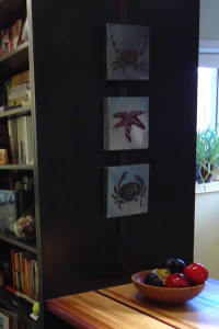 Sometimes the best place to feature art is on cabinetry. When we designed the kitchen bar area shown to the right, the end of the bar merged into a new pantry/bookshelf. The side panel cried out for a small grouping of art, but rather than punch picture hook holes in the custom woodworking, I suggested hanging the three 8”x8” canvasses on a ribbon that could be suspended from the top of the unit. Now if the homeowner ever chooses to change the art, she won’t be left with any unsightly holes.
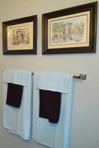 Bathrooms are another location often overlooked when it comes to hanging art. I love placing art over towel racks and then choosing towel colours that play off the colours within the art itself. When hanging art over a towel rack, remember to leave enough room for hands to reach out, grab the towel and pull it off the bar. If the art and towels are hung too closely together, a painting might just go crashing down to the floor. I usually leave 6” between the towels and the art and this is the same separation I use over headboards, couches or chairs.
Recently I was hired to do a colour consultation for a bedroom makeover and through the course of the consultation I discovered that the homeowner had quite a few paintings in storage. I suggested we create a montage of West Coast pieces for the wall opposite her bed so she could enjoy them while lying down.
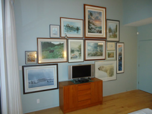 This was a complicated layout and required measuring and photographing each piece and then creating a wall plan on my computer. Plan in hand, it was still a little tricky when the time came to hang each of the 13 pieces, but it was worth it – it looks just awesome. The photo doesn’t do it justice.
Although this group of paintings was opposite the bed, the headboard wall is the usual place to hang art. When hanging art or photography over your bed, don’t hang anything heavy, breakable or with sharp edges such as a metal wall sculpture. We live in an earthquake zone and if the art jumps off the wall during an earthquake, it will most likely land on your head – ouch!
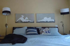 My only choice of art over a bed is an unframed canvas. It will still hurt a bit but it won’t cut you or give you a concussion, nor will it fill your bed with broken glass.
Speaking of metal art, when I was creating the vignette of 13 west coast paintings for my customer’s bedroom, she asked me what she could do to enhance the metal sculpture in her dining room. She knew something wasn’t working but she didn’t know what. The wall was the colour of straw and the amber shades within the metal where completely washed out.
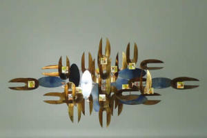 A simple change of colour for the wall was all it took to bring the metal to life, I chose a colour that was darker then the amber tones but lighter than the blue shades and now the art pops beautifully against its new backdrop.
 Evelyn M, Associate of Interior Design
250-204-4417
www.EvelynM.com
Evelyn M Interiors/Design House BC
Evelyn M Fine Art
See all articles by Evelyn M


I find it very difficult to read an article when it is printed over pictures or photographs. Many articles are very interesting . Do others find the same?